-->

Wednesday, February 27, 2013

Clean & Simple

I occasionally participate in some CAS challenges on various blogs.  I made this card for a couple of them, Less Is More: Paper Piercing and CASual Fridays: Hi Ho Silver.


 I've had this stamp for ages but have hardly used it.  Isn't she pretty though?  I stamped her on a separate piece of cardstock and then took some silver Distress Stain and ran it around the edge.  I added a little somethin'-somethin' to her hair by poking little holes following her wavy locks.


Now I just need to find somebody who's getting hitched to send it to...


Monday, February 25, 2013

This Delightfully Fabulous Imperfect Life

Today my niece turns 16. We don't get to see her nearly enough but when I think of her I instantly picture her bright smile, keen sense of humor and generosity of spirit. When pondering a birthday gift I hadn't a clue what to get for her.  I decided to create a little something for her to hang in her room.


I started with a 5 x 7 canvas base which I covered with Mowed Lawn Distress Paint (lovin' the new Distress Paints!).  I spritzed it with water to get some texture in the background and after it dried sprayed some Cut Grass Dylusions ink through a letter stencil.  The dots are Picket Fence Distress Paint and then the houses were stamped with Memento ink.  The leafy border is hand-drawn with the leaves colored in with Vibrant Turquoise Dylusions ink.


My little lady is made from old book pages sprayed with Dylusions inks, hot pink wire and doll hair.  The stamped bottom border was colored with yet more Dylusions inks. 


Here's another view of my girlie.  As luck would have it the challenge over at the Stampotique Designers blog this week is to use text in a project.  Bonus!

Happy Birthday, Mara!


Sunday, February 24, 2013

Art Journal Pages

I've been dabbling in my art journal the last couple of days.  This first batch started with a background page that I did early in December.  I was really grumpy and not feeling Christmas-y at all.  I used a lot of black and dark green. I like the way it turned out though once I added the leaf border and bits of white and lighter blue.


You can tell I've been looking at a lot of Dyan Reaveley's stuff lately - note the squiggly plant-like thingies.  Love hers and borrowed that style.  Can you find the elusive beast?


I had some black cocktail napkins laying around from another project and used those for the flower stems and leaves on the left.


I have a page that I shared a week or so ago that I haven't been able to stop tweaking.  The butterfly kept bugging me (ha-ha!  No pun intended!) so it went through several transformations.  Here's the latest:


Below is the original.  I was thinking the butterfly needed a little more oomph and something to make it stand out. I also added some more tidbits to the background - little bugs and things and some more flowers.


I think I'm done with this one for now.  Maybe.  ;)


Sunday, February 17, 2013

12 Tags of 2013: February

Making my January tag got me going.  I had to whip up the February tag too.  :)


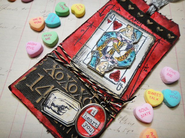
I borrowed a few things from His Royal Tagishnous - color scheme, distressed embossing, tissue tape ribbon, and the Queen of Hearts.

I started with a manilla #8 tag.  My first attempt used Spun Sugar and Barn Door stains for the background.  They blended nicely but the Spun Sugar was too light.  I sprayed Bubblegum Pink Dylusions on top of that with an extra misting of water to blend them and that did the trick.  Added some water drops and then randomly stamped with my heart border stamp (just got that the other day on sale for $2 - woop woop!) in red.  Some torn sheet music and Walnut Ink around the edges finished off the background.


I love these playing card mini embossing folders.  I tried it in red and black cardstocks distressing the raised edges but it wasn't looking like I wanted it to.  Instead I decided to use the faux letterpress technique with Barn Door DI.  Love it! (Technically it's backwards - look at the Q - but I like the areas that are recessed and colored).  The black cardstock attempt is a nice backdrop to make the white card stand out more.

 
Her crown is stamped using Tarnished Brass Distress Stain with some red rhinestones, uh...er...jewels, to finish it off.  The fleur de lis necklace was really a copper color but I used the gold alcohol ink to get it to the right color and strung her necklace with bakers twine.

Last was the sentiment using stamps and Dymo tape and the tissue tape crinkled to look like ribbon.


Here's Tim's masterpiece:


I can't tell you how many times I've eyeballed the new mini blueprint stamps - on the top of my Wish List for sure - but I think my mini embossing folder filled in pretty well in the mean time.

Thanks for stopping by.  Happy February!


12 Tags of 2013: January

Yep.  Procrastinating again.  I just got around to Tim Holtz's January tag this morning.  Yesterday I mozied on down to my local scrapbook store (heretofor refered to as LSS per scrapbooking parlance) yesterday afternoon to pick up my new post-CHA goodies.  I finally grabbed some Dylusions stamps (only sentiments this time but I've got my eye on some of those delish images) and a few bottles of the new Distress Paint as well.  None of this stuff was used on my tag, but it did get me to the crafting table to make this:

 
In typical attic elfish style my tag looks nothing like his so let me help you with the similarities.
 
I started with a #8 manila tag which I ran through the Big Shot with a honeycomb embossing folder.
Inked it up with some Wild Honey, Peeled Paint and Walnut Stain Distress Inks and flicked water about to get some droplet-y looking bits.
 
Instead of the clear film strip he used I put some strips of washi tape on the upper left.
 
No gears but I die-cut lovely butterflies out of some scraps from my mixed media pile.  They had originally been sprayed with Dylusions inks in beautiful bright colors but I toned them down for this by dabbing some Walnut Ink DI over the top.  A bit of Diamond Glaze gives the butterflies' bodies some dimension.
 
 
 My sentiment panel is similar to his but I didn't have the fancy clipboard piece so I just stuck it on there. It was't supposed to be this dark but I accidently smooshed my blending tool on the Walnut Ink pad instead of the Wild Honey one when adding some color.  Oops...those two are most definitely different.
 
I really like crinkling up my ribbon, but true to Tim's example I left it uncrinkled and died it with Peeled Paint stain.  I stamped the 'somethings' from the sentiment (something to do, something to love, something to hope for) on the ribbon with some Fabrico ink that was hiding in the dark recesses of my ink drawer and finished off the tie with a silver key charm which I warmed up with some gold alcohol ink.
 
 
So that's it.  Here is Tim's tag:
 
 
See the similarities now?  I need to figure out what to do with all of these tags I'm making.  Right now they get jammed into a box after I photograph them, but certainly there's some better use I can put them to.  Would love to hear what other 12 Taggers do with their tags once finished.

Tuesday, February 12, 2013

End of the World Art Journal Page

I really like this sentiment.  Since I recently picked up a butterfly stencil I had a good excuse to use them both in my art journal.


I gessoed many of my art journal pages a while back.  The only drawback to this is that it really mutes some of the delicious Dylusions colors.  The muted colors work here though, I think. 

The background is sprayed with Bubblegum Pink, Lemon Zest and Vibrant Turquoise.  I sprayed some letter/number stencils with Black Marble and more Vibrant Turqoise then stamped the foliage along the bottom with Tuxedo Black Memento ink.  I randomly stamped a script stamp with Distress Dusty Concord (as I wrote this I realized that pretty much disappeared and I went back and re-stamped some areas).  Deciding I needed a pop of bright color I pulled out some magenta acrylic paint, dabbed some bubble wrap in it, and mooshed that here and there.  I did that again with cerulean paint and a bottle cap on a couple of sides.

Here's a little closer look at the butterfly. 


Can you see the purple Stickles that I added to her body?  Love this template by Balzer Desings.  It comes with a swirly overlay (I dabbed over that with Bone China Distress Ink).

I think I'm done.  Loving this art journal stuff.  Makes me feel very artsy fartsy.  :)

Friday, February 8, 2013

February Calendar Page

Hey!  The month's not even half over and I finished up my February calendar page.  I'm even tempted to get going on March BEFOREMarch 1st...crazy.


ANYWAY, I was prompted to get this one done by the Stampotique Red, Pink & White challenge this week.  I was going through the template box at preschool the other day and found several broken letter templates.  Bingo!  No good for the kiddies but I was all over bringing them home to use as stencils.

I started with water-misted watercolor paper sprayed with Dylusions Ink - Bubblegum Pink and Postbox Red through large and small alphabet templates.  Apparently some little person had used blue marker the last time on the templates because as I sprayed a bluish-purplish color appeared right around the edges of the letters; I liked it (will have to remember that). 


Dried it a bit and sprayed the whole thing again with pink and red.  I still have some circle templates from when I first started scrapbooking.  They've been gathering dust for ages, but I pulled them out to make the 3 large circles on the right.  Next I brushed some white gesso onto bubble wrap and randomly dabbed that on my page.  I really like how the gesso soaked up the background color.

Following the bubble wrap I took a script stamp with grey ink and randomly stamped about.  Next came a bottle cap with white acrylic paint and I attempted a cork with black ink in the middle of those circles.  A fail was Picket Fence Distress Stain dabbed down the sides as well.  It isn't really visible as my background color is so bright the stain gets lost.  The background is finished off with a small circle stamp and black ink stamped on the sides.  I may have gone a little overboard with circles today - ha ha!


To finish the calendar off I stamped the month title with a heart image and red ink onto white cardstock.  Detailed around them with a black pen.  Eric and Linda were stamped onto cream cardstock, colored with Copics and cut out to fit in the top circle.  The calendar grid is simply printer paper swiped with Spun Sugar Distress Stain.  I splatted a dab of Barn Door Distress Stain in the middle of each square stuck it onto the page and, thinking I was OD'ing on red and pink, stuck some black washi tape on the corners.

Wah-lah.  February.  I'm ready now.

Tuesday, February 5, 2013

Kraft & Cream

Kraft is such a versatile color to work with.  I like to pair it with bright, vivid colors, but the challenge this week over at Less Is More is to create a card with only kraft and cream.  Here's what I did:


The flowers are made using a heart punch with scraps of various papers I had laying around - book page, sheet music (colored with walnut ink Distress Stain) and a tag that had been stamped on.  I finished the flowers off with little buttons in brown shades.

My first attempt is quite different.  Still kraft and cream but much busier so I decided it wasn't CAS enough for the challenge.  It makes me chuckle though so here's a peek at that one too.


Thanks for stopping by today!